Posted by dravon in LiveJournal, Project Review | Comments Off on Black Doublet made to match pants
Black Doublet made to match pants
Several years ago we commissioned a set of clothing from Brayton’s Legendary Costume Works. This was when they were first getting starting but they quickly grew too busy to complete the outfit. Brayton finished up the pants, then gave me the material he had left. From there, I drafted the doublet and made it to match.
I have to say, they matched VERY well!!! So much so that people with an eye for clothing, like Logan, had no idea they weren’t made at the same time or by the same person. *polishes nails on shirt* I’m very proud of this one, even though I know that all the black wool is a bit over the top for multiple reasons. Primarily — why on earth would I put my husband in BLACK WOOL (heat absorbtion and retention) in the DESERT in SUMMER? Egad. Poor man. Fortunately, this year’s run of fair was pretty cool all things considered. Secondly, black is the color of nobles. True his character was knighted by the unterbaron of the faire, but still. It’s a bit ostentatious for his character in terms of color. Design, I love. I like the detail that Brayton chose to use and I’m even more thrilled that I figured out to emulate it so perfectly.
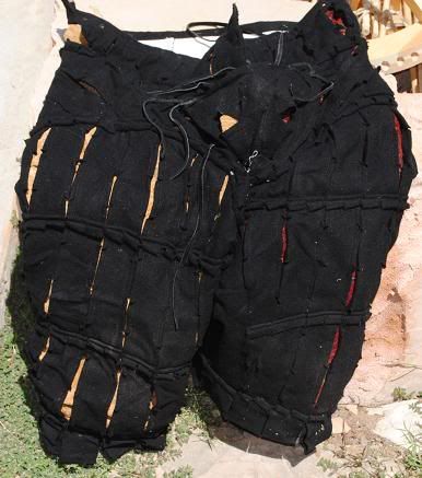
Here are the pants that I had to match. Unfortunately, they did not survive this first run of faire. While the seams held, it was the material running through the entire crotch line and down the right leg that tore wide open. All the way through the canvas interlining which was used! The fabric tearing is such that I cannot repair these, and these are the best pictures I’m able to get without highlighting the rip, which is not the point.
Here is the front. Miles asked for a new type of design for the codpiece – a functioning one. In order to make this, a hole was cut for his junk and the codpiece sewn to the base and edges of the hole to make it workable. Turned out the design was amazingly comfortable, but it also created a weak point in the structure of the pants. Since the pants were based on a jeans design with the seams put in differently places, the structure or fit of the pants was not up to the task of holding integrity when stressed. This is why they fell apart, which was in NO WAY a fault of the construction but rather a fault of the design idea which was uncompensated for because it was a first. I’m not going to highlight the codpiece any more than this because I have some ideas for new pants which won’t fit like jeans and will be made from the ground up to work with a gap for a man’s junk. We’ll eventually find out if the new version will hold up to long term wear better than the 1.0 version did.
Before wearing them for a full season, he shared the working cod piece with another fellow who was making pants. He found the new design so comfortable that he now refuses to make these pants any other way!
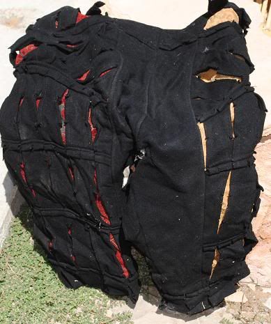
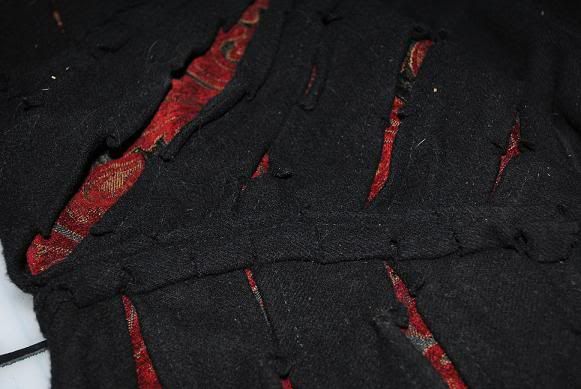
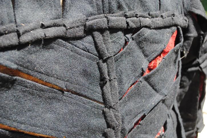
Here’s a detail of the decorative work which makes these pants so visually distinctive. It was this decorative work that I had to emulate most closely in order to make the doublet look like it was made at the same time as the pants.
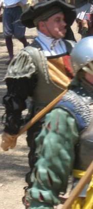
Now for the doublet itself. Unfortunately, I was not able to get a picture of Miles wearing the ensemble when the pants were still wearable. I’m stuck with having to scavange from those folks who were at fair. So far, I have only 2 tiny partial images of him wearing it and the images don’t really help to illustrate what the pairing looked like. Both images come from Lynn Decker‘s Facebook page. I’m assuming she’s the photographer of the pictures. If any other’s show up, I’ll be editing this post to add them.

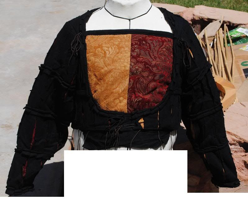
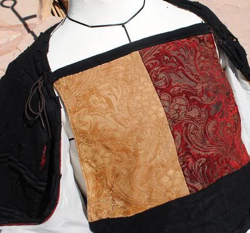
Now for the doublet on the dress form images. Here it is from the front. The gold and red brocade underlayer is countercharged with the pants. The dress form is also extremely realistic to Miles’ frame, and he’s not overly fond of that being shared so I’m editing the images to prevent this realism from being shared. 😉
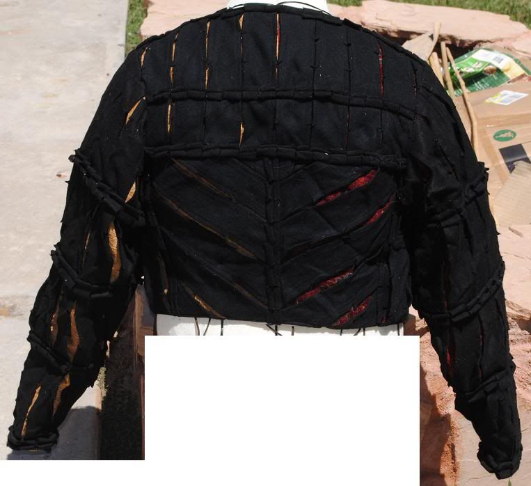
Here is the back side of the doublet. I had to figure out a way for the back of the pants and the back of the doublet to work together visually. The center back of the pants is solid material, which is necessary for sitting and the general use that the butt gets, but it wasn’t necessary for the center back. I followed the line of the center of the pants up to the shoulder blade line, and use the angled bars of material to help create the visual impression of a narrow waist with broad shoulders. The angled bars followed the same line as the top bar of the pants. Overall, the combination worked pretty well but it was the only area of the pants/doublet combo which I was never 100% happy with.
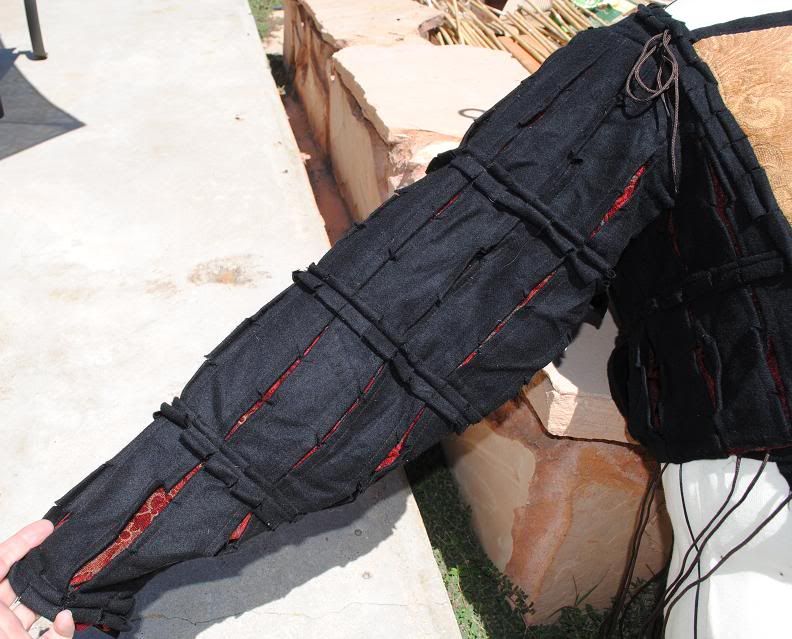
The sleeves were a bit of a breakthrough. On the burgundy doublet, the sleeves look great but they don’t fit great in terms of use. Those are constructed in such a way that arm mobility is limited. I’ve learned, through annoying experimentation/trial&error that the more pronounced the sleeve cap is the more limited in motion the sleeve is. That’s why when I deconstruct men’s shirt that the sleeve cap line is very broad but shallow, while women’s sleeve cap lines (which the only one documented in all the Santa Monica classes on paterning, very annoying!) are much more pronounced. This one is made almost like a rectangle, with some shaved off at the bottom cuff and a small contour added to the cap line. I know this isn’t historically accurate, but my objective is to make functional clothing, not necessarily make it 100% historically accurate. Besides, I’m learning through trial and error at least some aspects of why the historical that I do know of what done that way, and when/where/why it altered. It’s been vastly interesting to piece that together, though hardly complete at this point. I know enough to sound like a real idiot to those who are historical construction experts. heh.
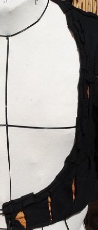
This is the shape of the doublet chest without the breast piece. I think it looks pretty good and does a phenominal job of making Miles look like he has this massively powerful chest. I can easily understand why this design was so popular with men! Made them look like fricken tanks.
I tried an experiment with the breast piece — I contoured it a bit. I ended up making it not quite wide enough, but the contouring worked very well! I also used some buckrum pad stitched into place in the same style as they use in men’s suit jackets. This gave the breast piece some structure without making a flappy piece of material or turning it into a board. I’m taking the Tailoring class this semester at Santa Monica and will definitely be taking all of my doublet designs to the teacher. I have this theory that doublets were highly tailored in a traditional tailoring method, and that method is NOT typical sewing. Incorporating what little I do know into the doublet has made a huge difference in terms of fit and hold, and I’m very much looking forward to learning more.
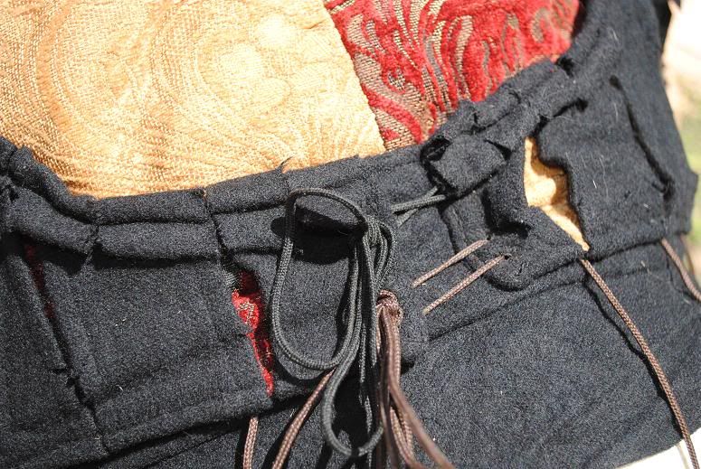
The first attempt at the breast piece was a complete failure in that I made it way too short. It was at breast line, not at the collar bone line. Remaking it gave me the opportunity to try another new thing: an extra piece of material in the front so that Miles could tuck the breast piece into this pants. This served 2 purposes: additional stabilization for the doublet and chest piece (zero riding up!!), and helped ensure that no annoying white gap appeared between the pants and the doublet, or worse, around the top of the codpiece. This worked out VERY well!!!!! He was very happy with this and wants it as a standard thing on all breast pieces going forward. In addition, I made the bottom 2 inches of the chest piece the same color as the overlayer of the doublet — in this case, black. Why? As you can see in the photo below, there’s a small gap between the 2 edges of the center front. With a black band the same height as the center front ties, this gap is completely invisible. He can now loosen the doublet quite a bit and stll have it looking great, with no bizarre color show going on to highlight that he’s being sloppy about the fit.
Here’s a look at the points which line the bottom of this thing. I mentioned in the post-mortem of the burgundy doublet that I wanted to make the points further away from the bottom edge, and that was definitely the right thing to do.
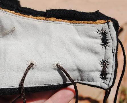
Here’s one of the points being pulled on very hard. When the doublet is worn with the pants and everything is pointed up, the higher placement of the points allows for a very minor overlap between the 2 without pulling on the points, resulting in a look that is more coveralls than top and bottom. When the body is in movement, there’s a lot of play for the points to move around without revealing that gap OR giving the wearer continual wedgies. It’s rather impressive! I’ll definitely be keeping this design going forward. The only thing I need to work on sitting down, which is still hard when fully pointed in.
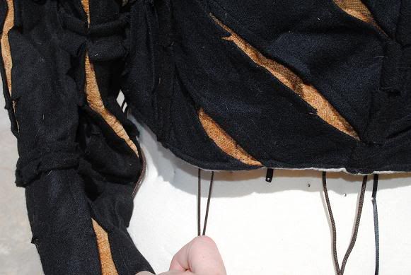
And lastly, here is detail of the embellishment. I learned that the strips are 2″ wide, with a little slice put into the seam edges roughly every 6 inches or so. The garment was made in 3 layers. First up, the lining and interlining. Then I made the brocade shell. Onto the brocade shell, I then laid out and tacked into the place all the strips in their positions according to my design. From there, I took another strip and sewed it together to make a fat pipe. After turning it so that the seam was on the inside, I sewed it to the lines which I had used to tack down the strips. I sewed it unevenly, so it was 1/3″ on top of the new stitch and 2/3″ below it, making the new detail look smaller on the top than the bottom. After that, it was a matter of snipping it every 1″ along the length. Viola! The doublet nicely matched the pants! Oh yes, the very last step was to insert the lining into the overlayers. This way, all the work is contained so that it looks neat and tidy no matter which side you’re looking at (see the points detail image above — there is no sewing visible where I tacked all the embellishments and strips to the brocade).
Overall, the modifications that I made to the burgundy doublet as I made this black doublet were spot on. I did learn some new things:
(1) Next time, I’ll go even further with the sleeves. I’m not sure I’ll do a straight line for the sleeve cap because that would allow for too much material to pool under the arms, but that will depend on the design of the sleeve.
(2) Make the breast piece slightly wider at the top so that it doesn’t move around to the outside edge of the doublet chest outline.
(3) Consult with the tailoring teacher on what he would think would go into the undergarment construction of doublets in period, given the visual evidence of woodcuts. Incorporate anything he says for testing.

